.jpg?ixlib=gatsbyFP&auto=compress%2Cformat&fit=max&q=75&w=375)
Today, let's embark on a colorful journey through architectural visualization and explore how the choice of colors can shape not only the ambiance but also connect deeply with traditions and cultures.
We've all marveled at those stunning architectural renderings and visualizations, but have you ever stopped to think about why certain colors are used and what they convey? Colors have a remarkable impact on how we perceive spaces, and it goes beyond aesthetics. They evoke emotions, tell stories, and are deeply rooted in cultural and historical contexts, reflecting cultural values and traditions.
As the first aspect, colors can define a neighborhood's identity. Traditional Scandinavian homes boast bold reds and yellows to combat long, dark winters. For example, In India, houses in the "Blue City" of Jodhpur are painted shades of blue, each with its unique story, while the vibrant blues and yellows in Mediterranean architecture capture the essence of the seaside villages. Also, we should not forget that colors often hold unique meanings across cultures and sometimes one color can have a positive meaning in one nation, and totally opposite in another. For instance, while white represents purity and simplicity in Western cultures, it signifies mourning in some Asian cultures. Understanding these cultural nuances is crucial when designing spaces for diverse communities.
Secondly, we are all aware of how colors can elicit strong emotional responses. Bright, warm colors like red and orange can energize and stimulate, while cool blues and greens create a calm and tranquil environment. Green color is often used in architectural visualizations to evoke feelings of freshness and sustainability. Imagine a lush green park surrounding a modern eco-friendly building. While yellow often finds its way into renderings of creative spaces. A splash of yellow in a modern art gallery? It's like a burst of sunshine on a canvas. In healthcare design, for instance, softer colors are often used to promote healing and well-being.
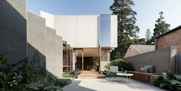
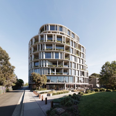
Different architectural styles often favor specific color palettes. Modernist designs lean towards minimalism with neutral tones, while Art Deco embraces bold, luxurious colors. These choices reflect the era and artistic movements that inspired the design. In our Australian projects, architectural designs always harmonize with the natural surroundings. Earthy tones like browns and greens are favored, reflecting a deep respect for the environment. That is what we like to translate there.
In CUUB, we are storytellers who use colors as our language. Each project is an opportunity to blend cultural narratives, traditions, and contemporary aesthetics. It's a delicate dance of creativity and sensitivity.